Healthcare brand system / Sleep diagnostics

Making home sleep testing feel credible, calm, and easy to adopt.
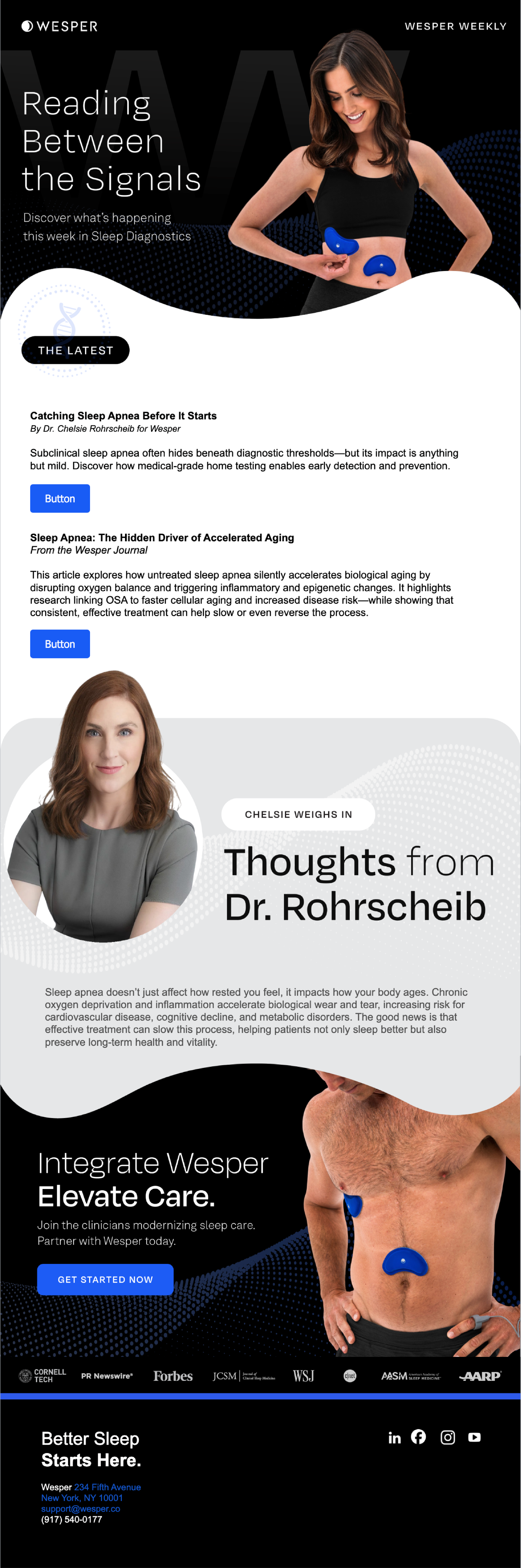
Figure B translated a clinical sleep diagnostic into a clearer brand, website, sales story, and conference system built for trust, speed, and buyer adoption.
- Positioning
- Website
- Sales story
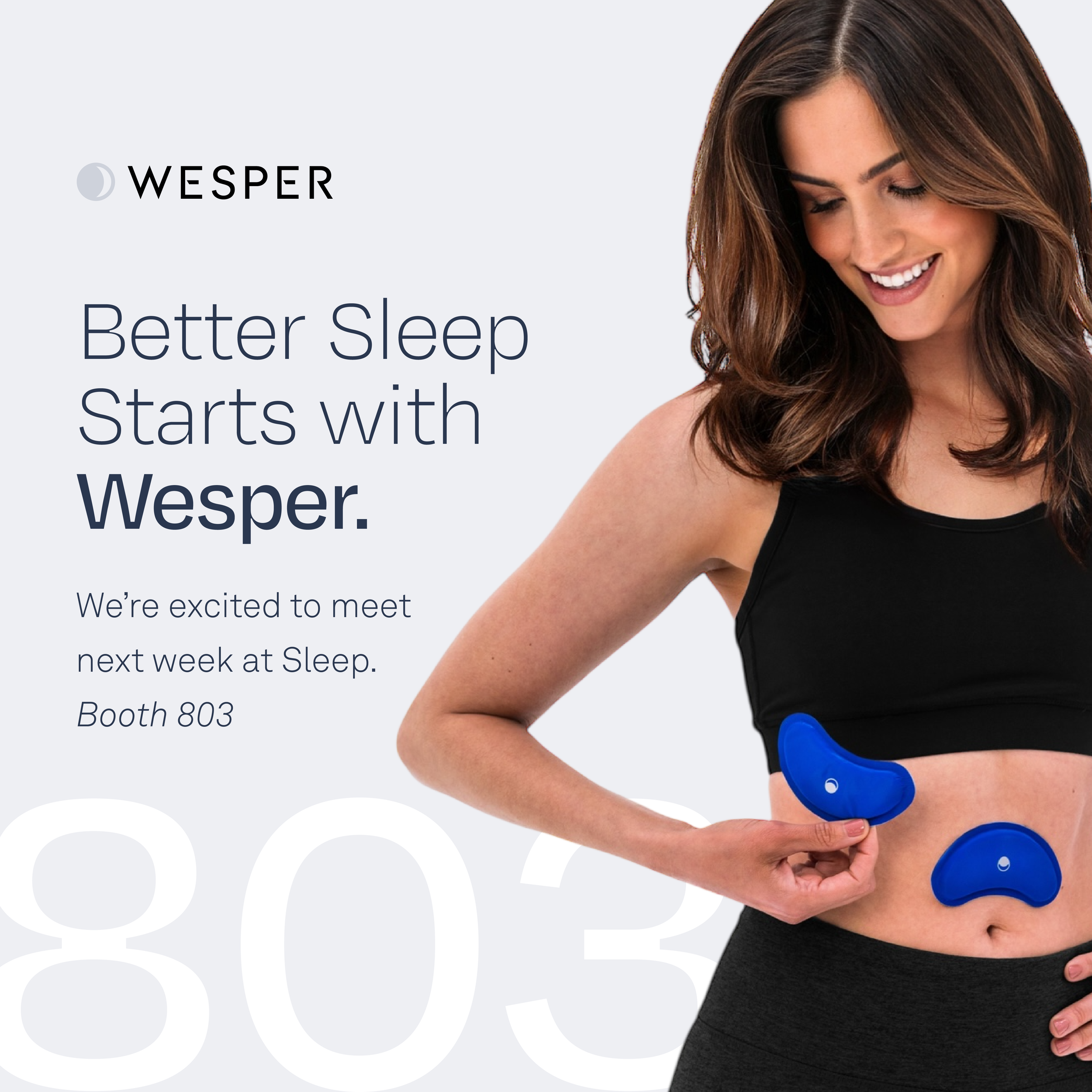
- Sleep 2025
Clinical credibility had to become commercial clarity.
Trust comes before adoption. The work made complex sleep diagnostics easier to understand, easier to believe, and easier for healthcare buyers to discuss.
-
01
Clarify
Turned the clinical value story into buyer-ready language.
-
02
Build
Created one cohesive brand, website, and sales system.
-
03
Convert
Supported booth traffic, partnership conversations, and seven-figure ACV.
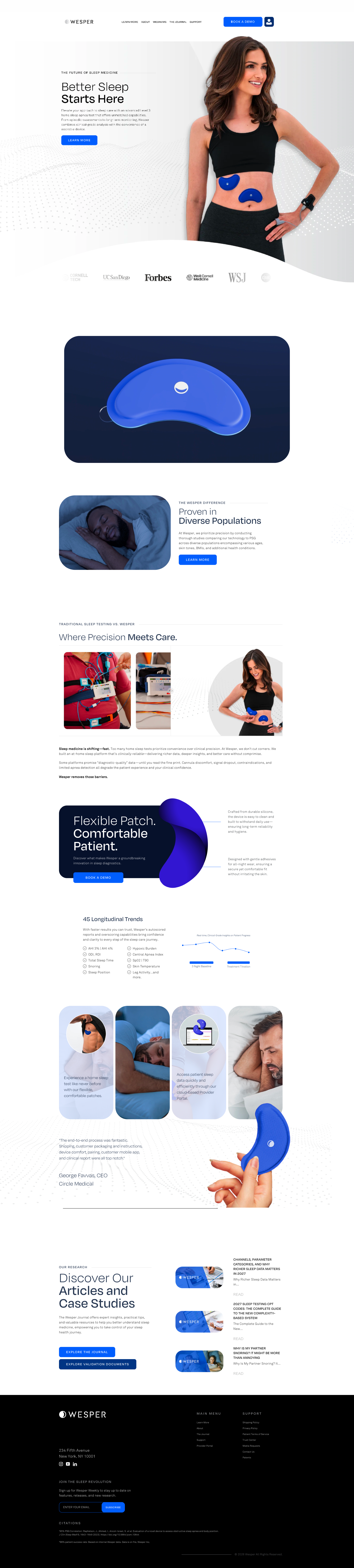
The logo stayed. The website learned how to feel clinical and human.
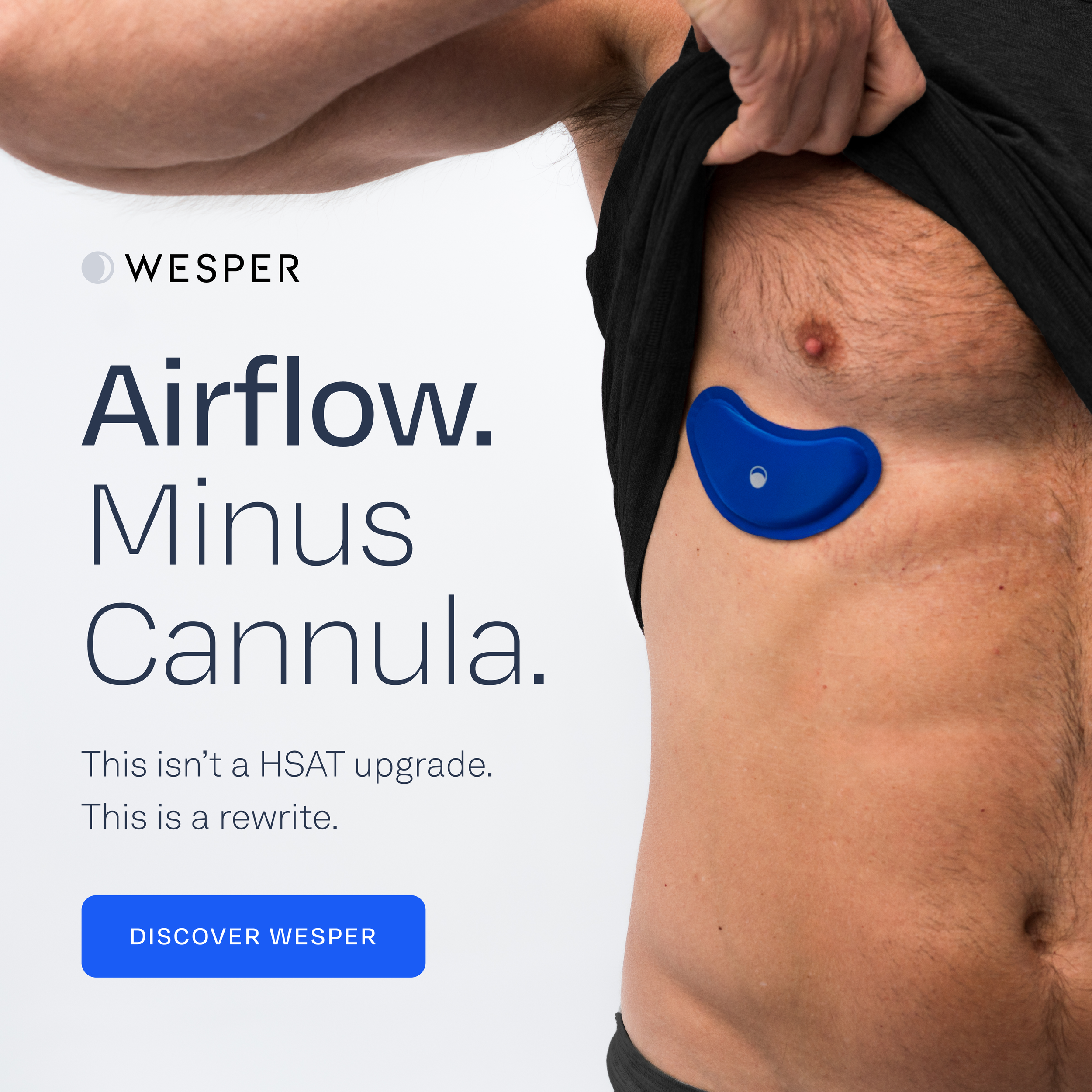
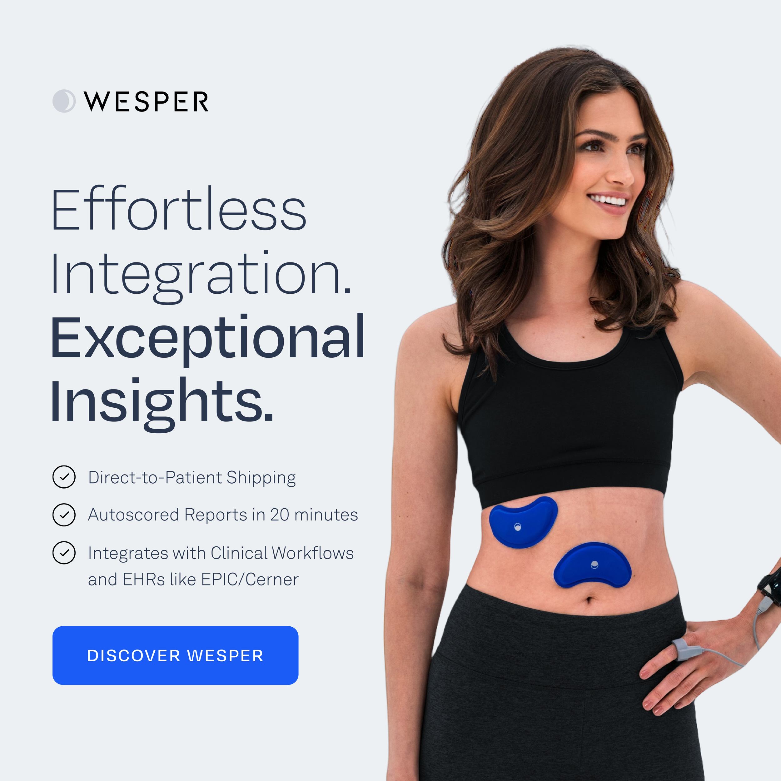
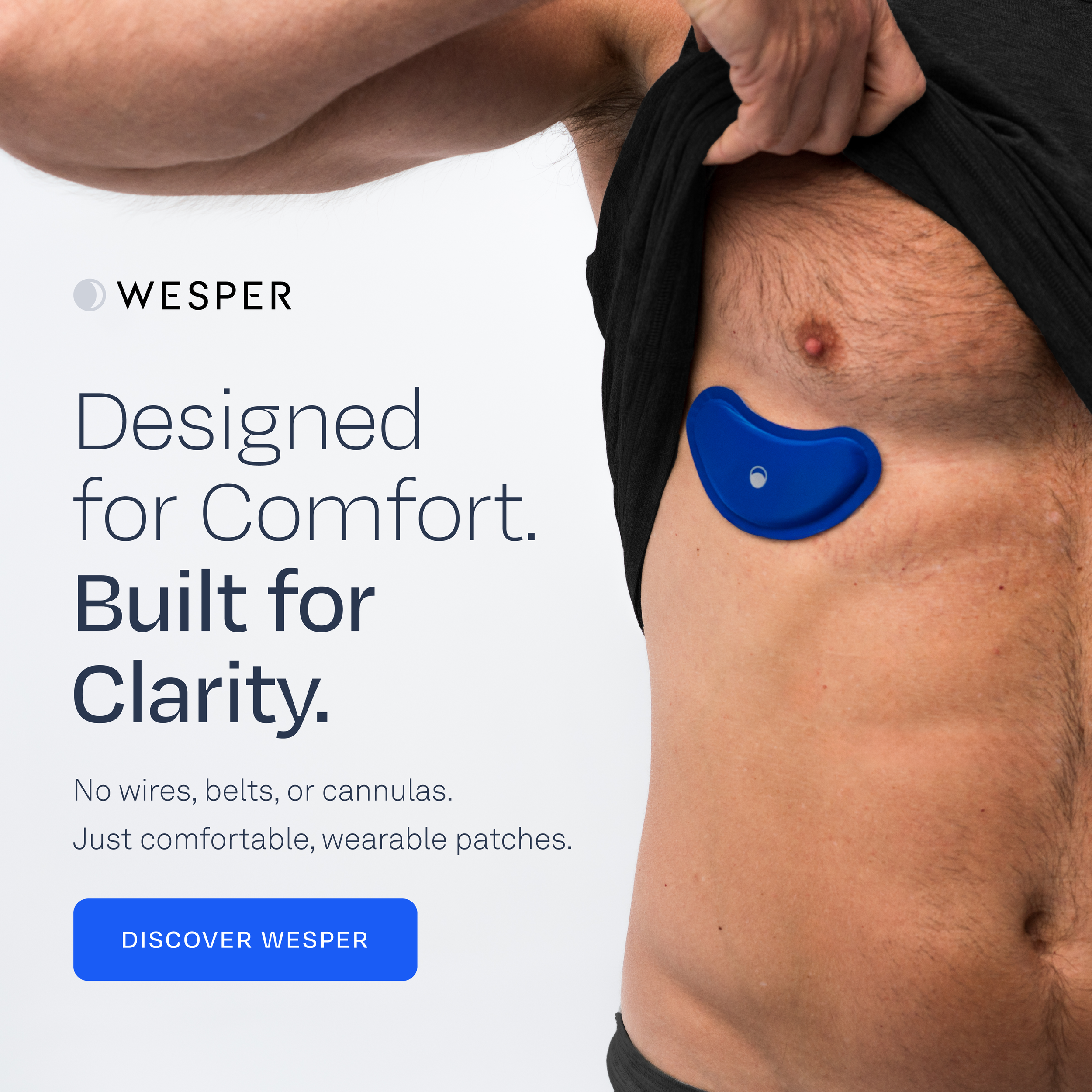
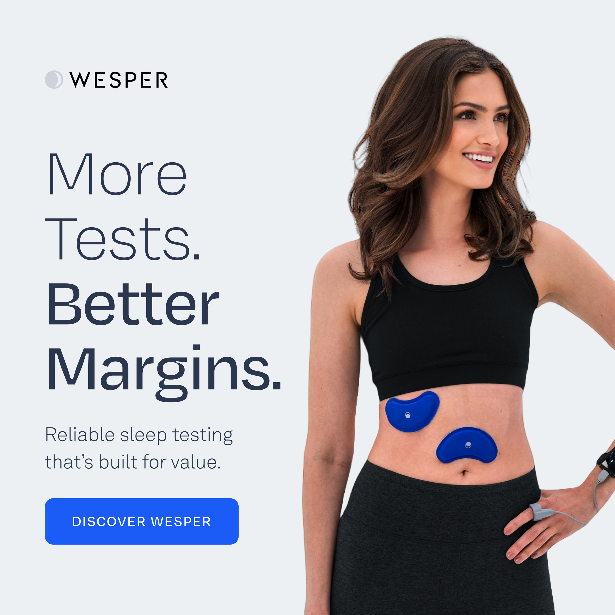
Figure B preserved Wesper's existing mark and focused the refresh where it mattered most: typography, visual hierarchy, page rhythm, and clearer brand guidelines for buyer-facing communication.

Produced to bring the refreshed system into motion, the video carried the same clinical clarity, softened forms, and human pacing into Wesper's buyer-facing story.
Cleaner type pairing gave the clinical story more authority while keeping the language approachable and easier to scan.
The refreshed rules clarified spacing, image treatment, color use, CTA hierarchy, and how Wesper should show up across web sections.
The logo remained intact. The surrounding system became softer, more consistent, and better suited for healthcare buyers.
2025 APSS SLEEP Conference

Accounts won directly from Wesper Booth Engagement
Neurocare, Inc- MA
Columbus Sleep Consultants- OH
Eagle Sleep Medicine -NC
SNI Neuro & Sleep- TX
Pulmonary Medicine Associates
Total ACV $1,026,000
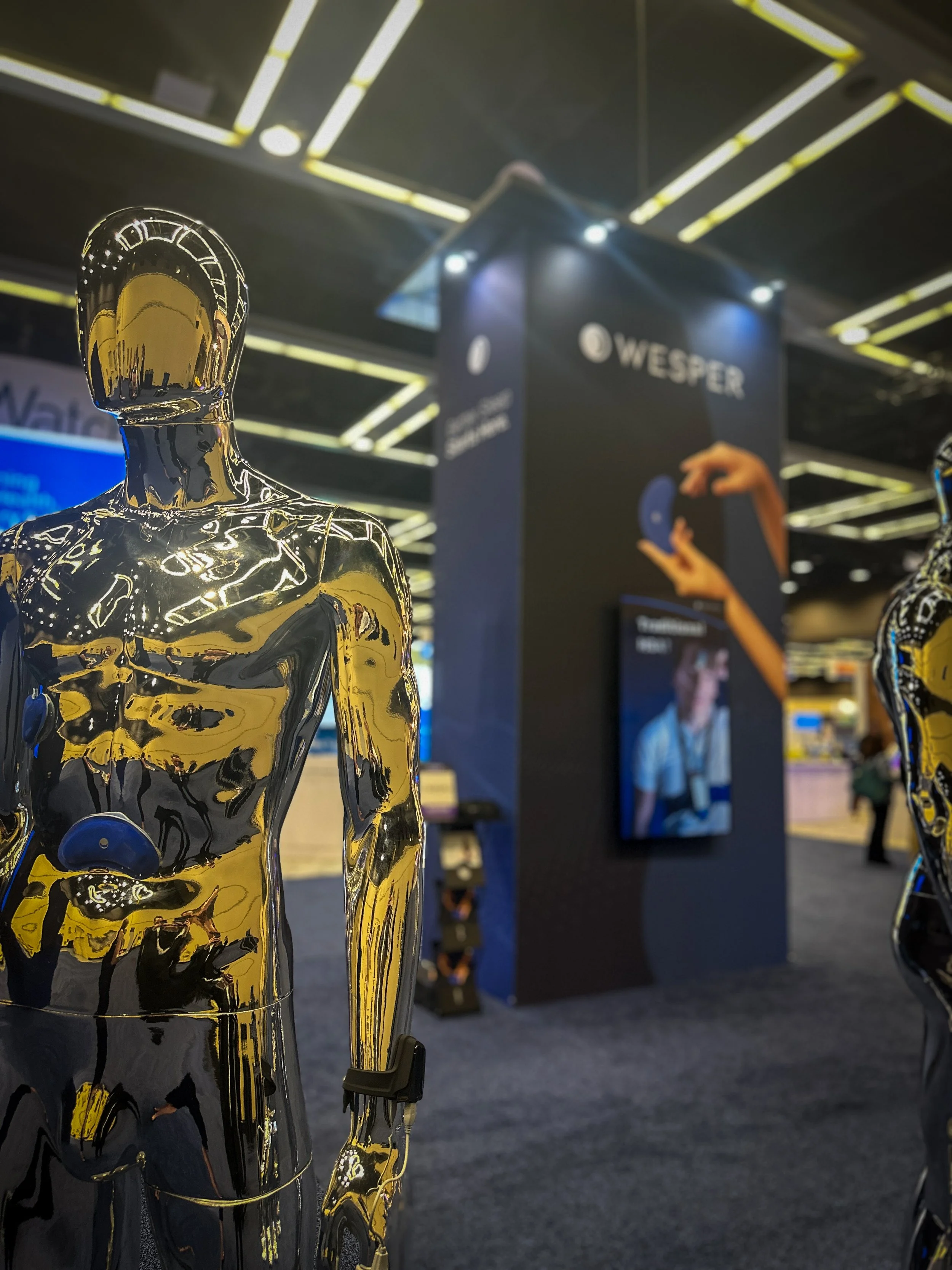
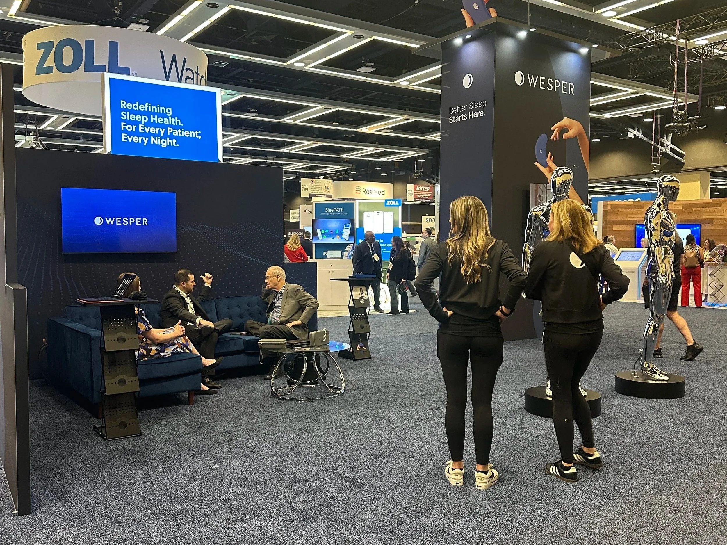
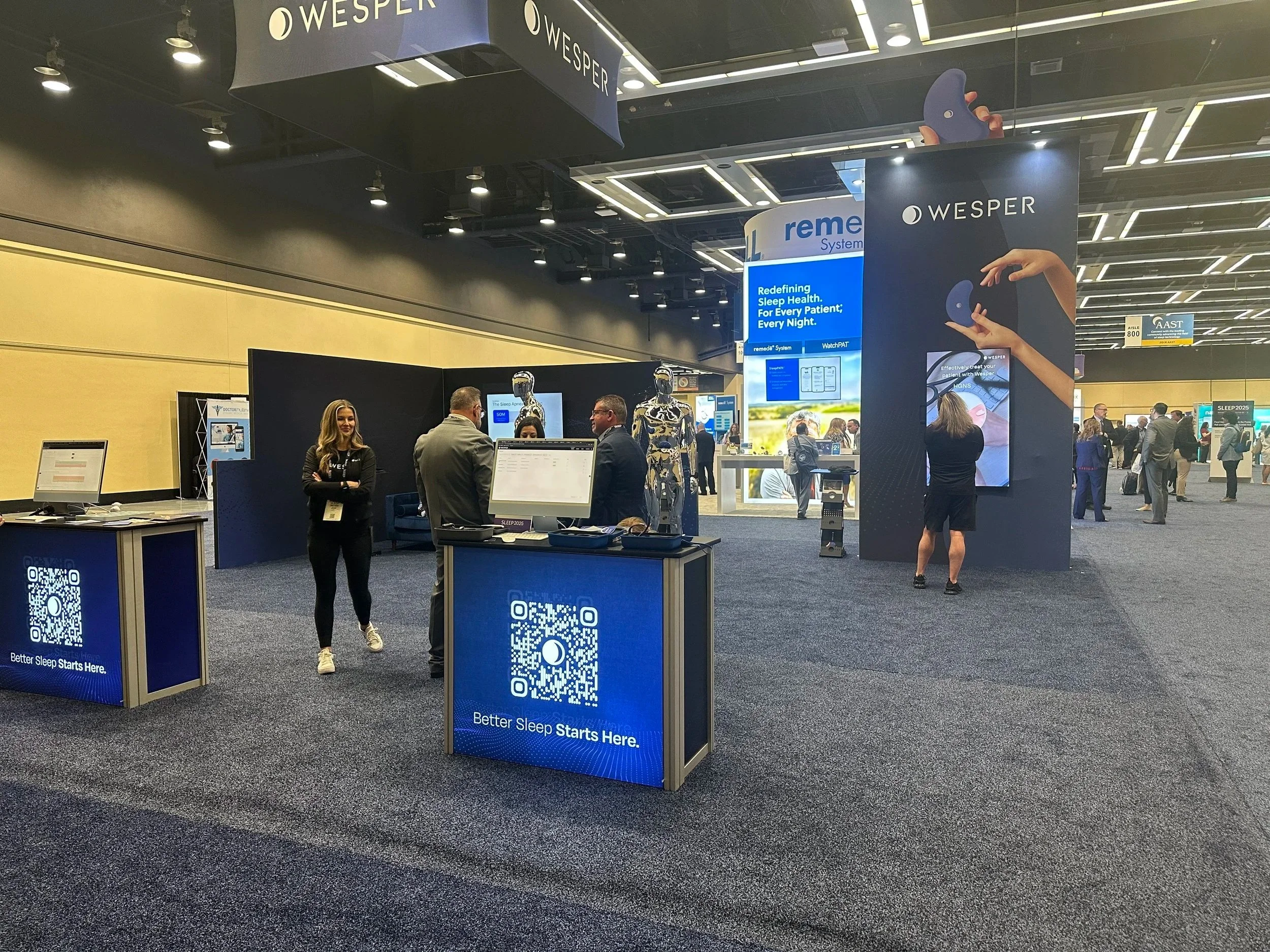
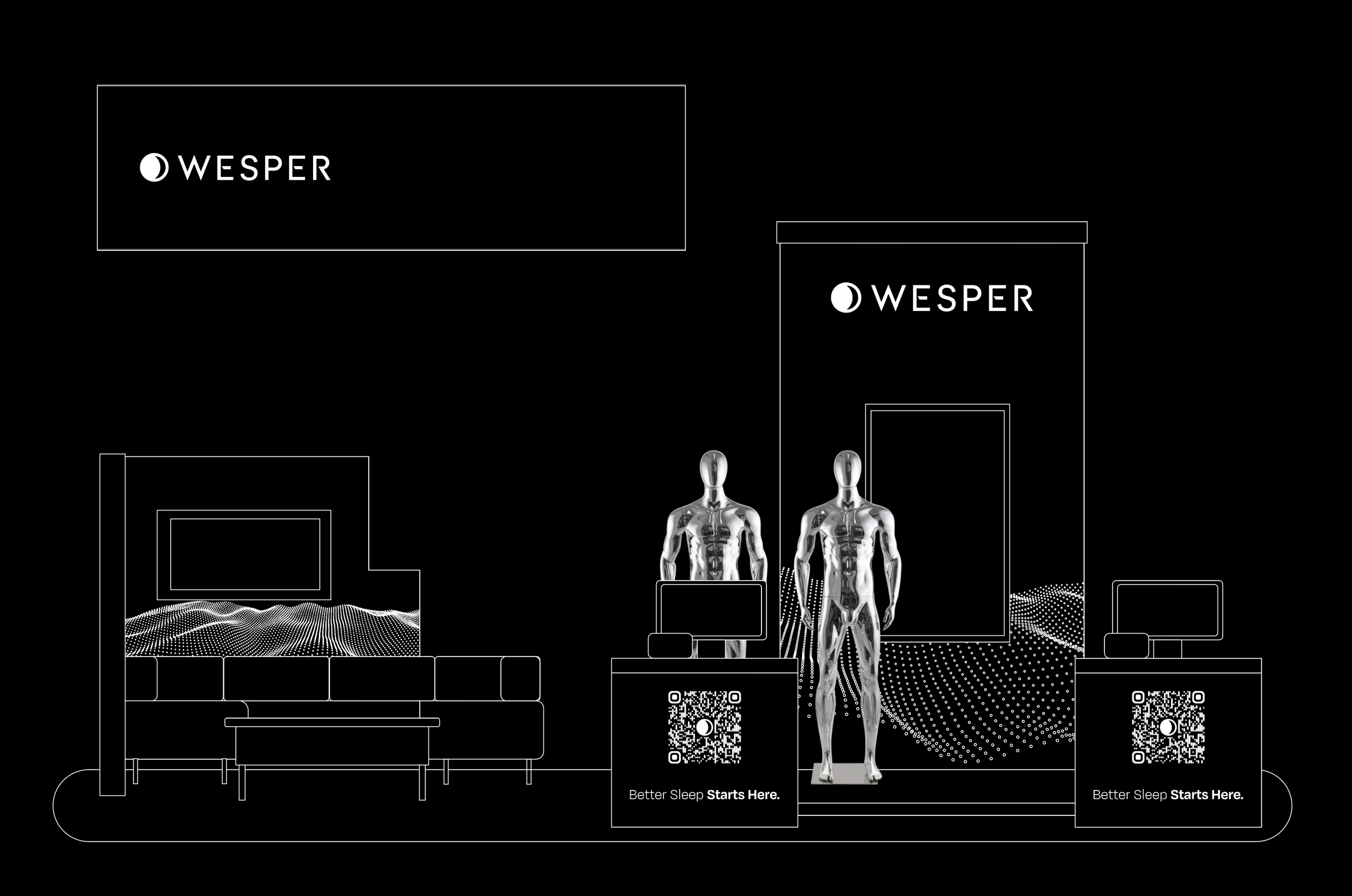
WESPER Booth,
AASM SLEEP 2025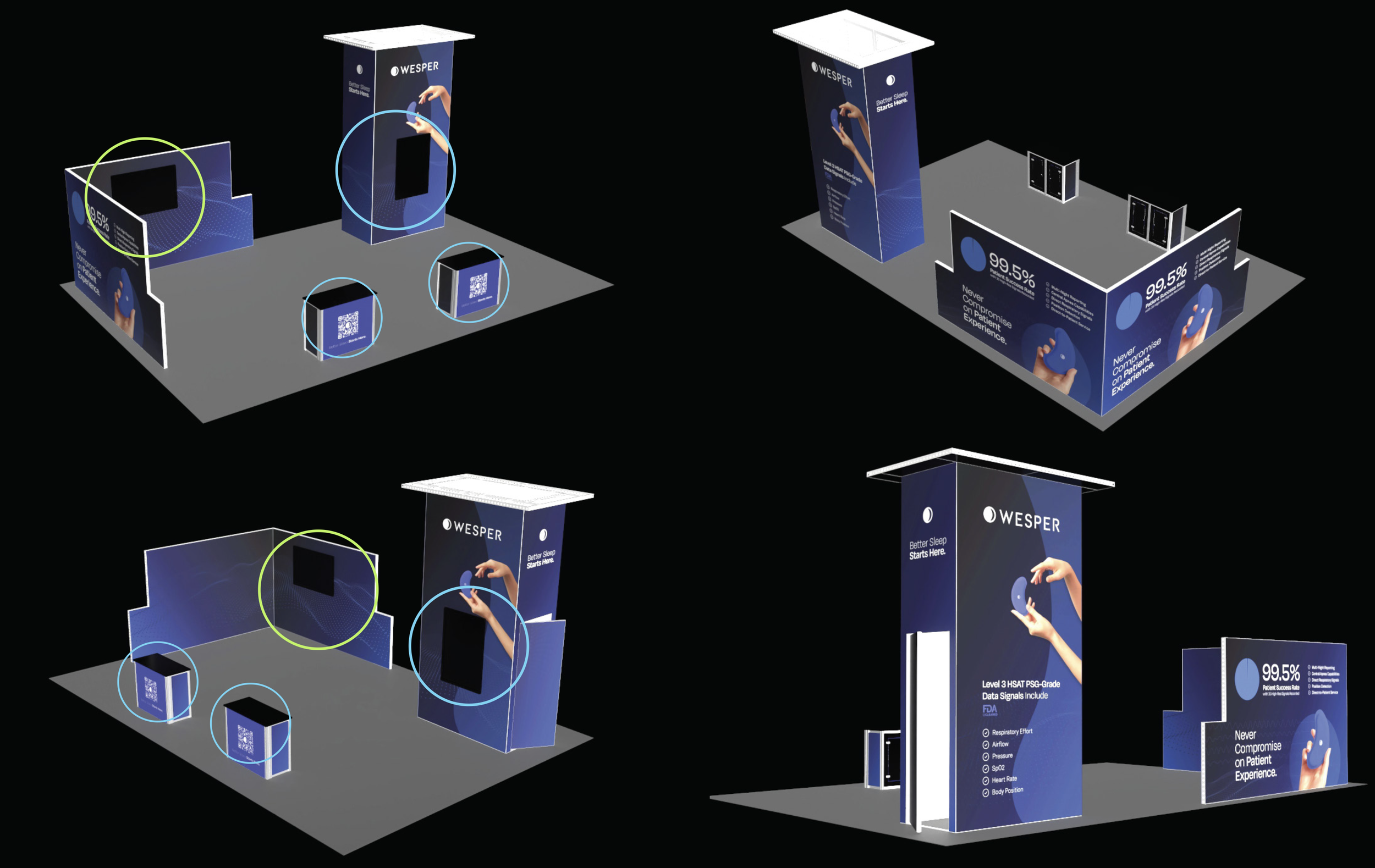
Experiential Design
Physical Brand Environment
for Trade Shows
In designing the Wesper booth, I focused on traffic flow, intentional engagement points, and differentiation within a crowded field of sleep medicine innovators. The result was a cohesive conference presence built to attract attention, support meaningful sales conversations, and strengthen brand recall.
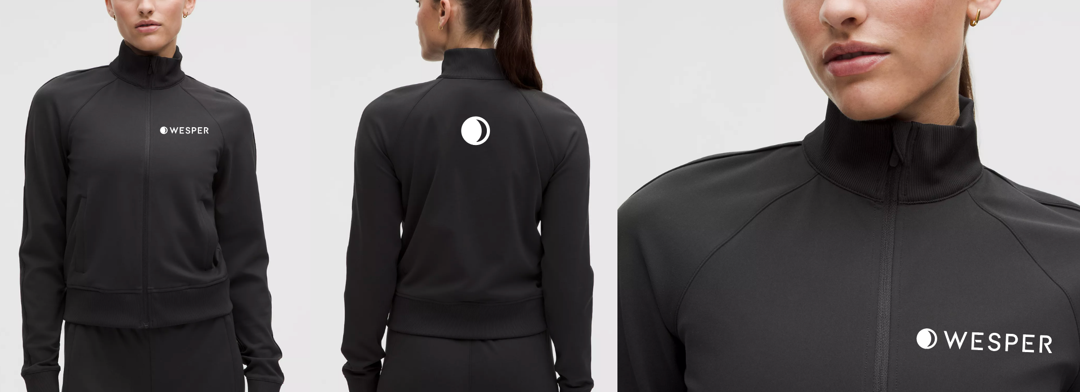
Digital displays, print collateral, sales kits, and premium branded merchandise created multiple ways to engage attendees, from in-depth discussions to quick, memorable touchpoints for passersby. The silver mannequins anchored the space visually and served as a natural conversation starter, helping the sales team clearly demonstrate how the device works and keep Wesper top of mind beyond the show floor.